bank hapoalim website
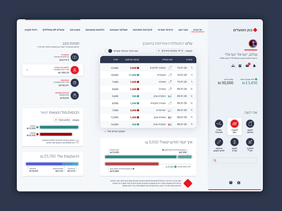
The power of using color in design is the immediate identification and decoding of its meaning. When colorblind people come across a green-red encoding convention, they cannot distinguish between the two because of their tonal identity. The indiscriminate dropped the existence of the convention. We have looked at how financial interfaces in Israel are dealing with a green-red convention and we offer solutions for color accessibility, through the studio's proposal to redesign of Bank Hapoalim website interface.
The full project at our blog https://www.joshua.co.il/the_oven_colorblind.html