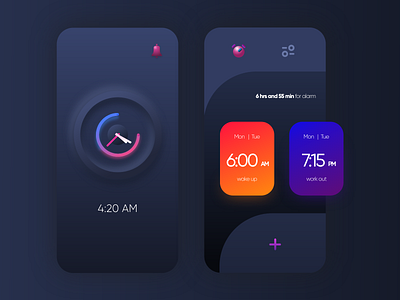
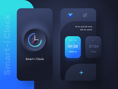
Alarm Clock UI
I have been rebounding Top Designers of dribbble recently to understand the wide range of things we can do with simple elements we use everyday. For instance, shadows play a very vital role in this UI. It is so simple but, gives the app an extra element. I love this.
It makes me feel like these guys are top designers for a reason. Always coming up with such innovative and creative stuff.
Thank you, Prakhar Neel Sharma for teaching me something new ! Very grateful.
PS: I am still obsessing over dark theme
PPS: Also, notice that I used different gradients to help people understand if it is AM or PM - Do you think this would help?
More by megpammi View profile
Like

