Wikipedia Redesign
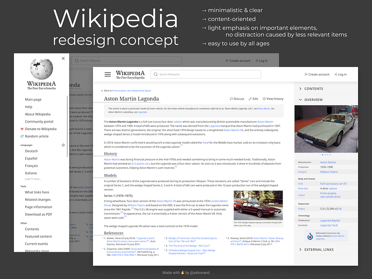
Redesign of Wikipedia website! I tried to follow minimalistic approach and two main rules: make important things easy to spot and use, and put not so relevant stuff just a little bit in the back. 1. New sidebar menu. Hidden from the main screen of an article, but easy to find and open. Then I switched some of the links in it to establish more stronger hierarchy in actions they represents than in actual website right now. I also slightly highlighted two important menu items, Random article and Donate, which made them very clear and distinct from other items while users aren't distracted by them at the same time if it's not their goal. 2. New Overview block. It now contains Contents of an article (hidden by default), main information about article subject, and External links as well (also hidden by default). Table data representations is now more clear and modern looking. 3. Navigation. There are several navigation improvements all over the page. Firstly, there's new "back to the previous article" button, it takes user to the previous wiki-page he was on. Also, the Discuss, Edit and History actions grouped together as they are all related to current article and should be near each other and easy to locate by user, I think. In the top header block there is nothing more than Search bar and two Sign In/Up actions to ease further website exploration in any given moment. 4. Miscellaneous stuff. I chose to retain the Main page menu item (even if it's clearly an overkill) to make website more accessible to people who isn't used to use logo for that action. Wikimedia block was moved up and placed in the Overview section as it's also a media related to the subject, after all. "Jump up" in References links was redesigned to be more clear to understand and use.
What do you think of this concept? What improvements would you suggest?
