Health Fitness Nutrition Logo
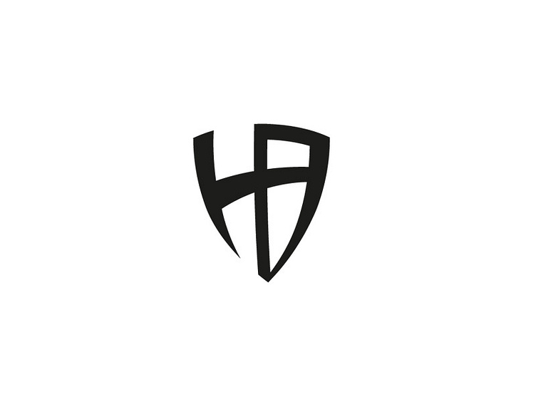
Work in progress logo for a client. Initial idea was the initials H and B inside a shield. The concept has developed into the shield being made out of the initials themselves. The client offers personal training, sport rehabilitation services, nutritional advice etc.
I'm looking for some feedback on whether you guys like the concept and if it fits the business. The client wanted the idea of strength (sports rehabilitation) and protection in the logo but also a minimal high end look and feel.
Thoughts?
Cheers