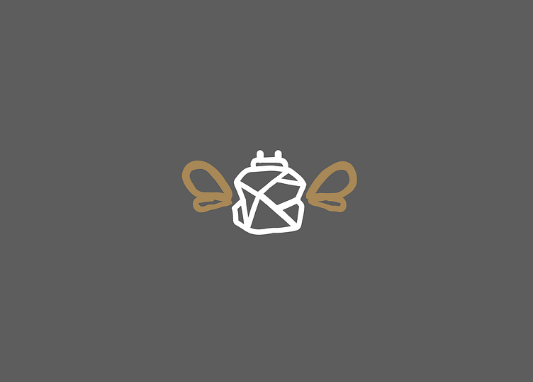
For the Bees Logotype
Designed with the idea of the crystallization of honey in mind. There are a lot of bee logos and I wanted to make sure I did something a little different. The wings would potentially be gold foiled if wanted by the client.
More by Ryan Flynn View profile
Like
