Acre Styleguide
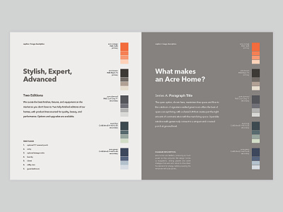
This is a style sheet I put together originally for print material, demonstrating typeface, color, and personality. I chose bold colors that fit the brand image and content matter, and worked with both light and dark schemes. Calibrated tints add lighthearted nuance for support content like illustrations and diagrams.
More by Nick Buccelli View profile
Like
