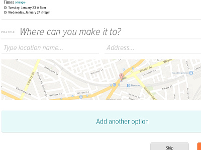
Forms that don't look like forms
This web app has quite a lot of necessary forms, and so I've been experimenting with ways to make the process less arduous for the user. I've tackled the issue by separating each segment of the form out on to a different screen (4 in total), each with a maximum of 4 form fields. I've used large text (proxima nova) and have done away with boxy form fields to make inputting data feel less like inputting data.
More by uǝɥdʎɐɾ View profile
Like
