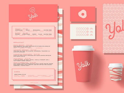
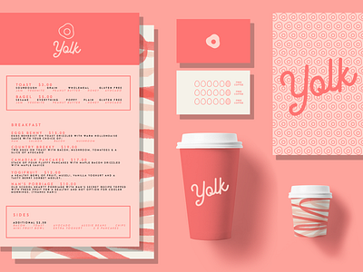
🥚 Y O L K - A second crack at it.
Part two of the Y O L K design I was working on. I made a few changes - tweaked the takeout bag a little (on the left) to make it more apparent and emphasized the boxes in the menu. Made the logo on the loyalty cards clearer as well. :)
More by Katie Lou View profile
Like

