Increasing conversion rates
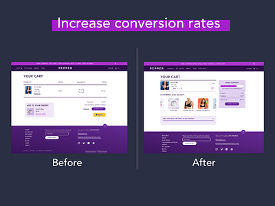
My take on how a check out page can be improved using design to increase conversion rates. There are a few key changes in the overall layout for a better experience.
Here you can see that I am trying to use psychology to let buyers know what others bought to entice them to buy more. The buyer also has a last chance to see if there's more that they want to buy - a win-win situation.
I've included a progress bar that lets users know they are only dollars away from free shipping. Once they added enough items to the cart, the progress bar will fill up - making it almost like a game.
There is also a small expandable box that lets users know what the return policy is, so they don't need to click away from the page to see it. This ensures that if they aren’t happy with the product, returning is a simple and easy process.
Check the live site here: https://www.wearpepper.com/
