Subscription Checkout
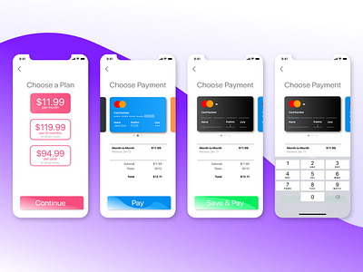
Continuing my journey with DailyUI. This is the second lesson. My goal here was to design a checkout process that made the interactive items pop and the static content clear but note overwhelming. I wanted to take a stab at using some saturated colors and gradients. I am not sure I am a big fine of this style but for a second UI I am happy. Also trying to improve my presentation as well.
Feedback is welcomed!
