Mo' Beziers, Mo' Problems
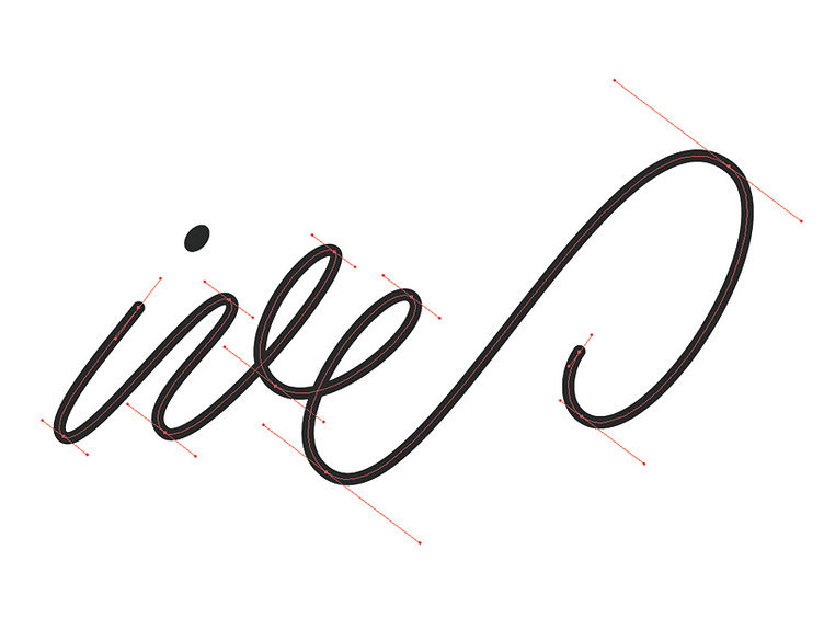
While vectoring a current lettering project, I came to this particular string of letters and noticed the interestingly small number of points I used to get the curves just right.
In almost every case, the fewer points you can get away with using, the better and more accurate your curves will be. There are always exceptions, but as a general rule, more bezier points does indeed cause more problems, especially when you find yourself trying to change something.
Keep it simple, keep it light. Not counting the oval used for the tittle on the 'i', there are only 11 points used for these three letters.
(Unfortunately, I am not working on anything for Sir Jony Ive, as much as I'd like to say that I am.)
More by Ryan Hamrick View profile
Like
