Portfolio
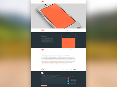
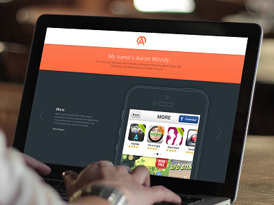
After sleeping a few days on the design, I wasn't happy with it, I've worked on a redesign that's more professional looking.
I didn't like the bold orange header in the previous design, it seemed too young, and cartoon like...
The actual portfolio is much longer, with all work displayed on the page, for this shot I have just shown one work sample (place holders for the moment..
The large image at the top, will probalby hold a different image too, not an iPhone, possibly a snowy mountain photo with some welcome text overlaid (going skiing next week, so hopefully I will get a good photo to use!)
The top nav will follow you down the page..
let me know what you think!
More by Aaron Moody View profile
Like


