Further Color Exploration
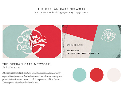
We're exploring a few different color options. We'll also be pairing the logo with type for each church that is involved in the network.
I'm going to experiment a little more with the shape placements. It goes without saying that the red is super powerful, and I don't want it to take away from the design. Kind of back and forth with the black texture as well...
More by Zach McNair 👋 View profile
Like

