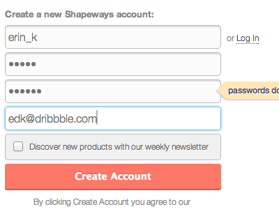
Signup With Error
An update to the design of our signup/login forms and error displays. Currently this design is only live on our API beta OAuth prompts.
The new error placement eliminates "herky jerk" where form elements used to jump around vertically to make room for error messages. No more!
More by Erin Keeffe View profile
Like


