Google Maps CSS transforms, redux
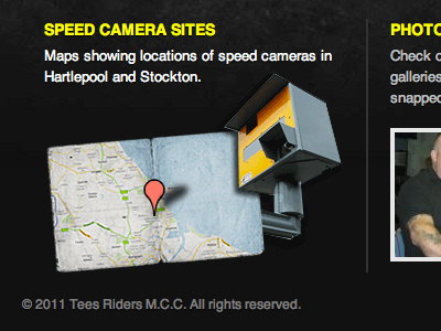
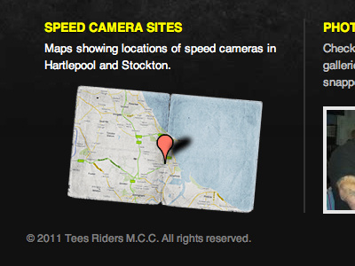
I get distracted by the shiny-shiny. After looking at the image out of context, I thought it looked quite boring, so I have swapped the map image to something more "speed camera-y".
More by Martin Bean View profile
Like

