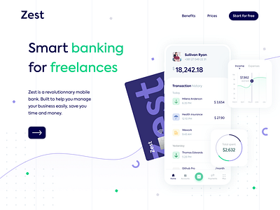
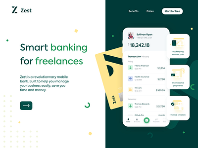
Zest • Homepage hero exploration V3
Hi there! ☀️
Sharing with you today the final design iterations 🎨for the hero area of the homepage for Zest. I've created and tried several color palettes, which one is your favorite ?
Also, this time, I've deleted the logomark and left the logotype, which is sufficient. This design is cleaner and more minimalist compared to the previous ones.
More coming soon, follow me to stay tuned 😃
***
Feel free to drop any feedbacks, I'd love to hear it!
If you want to support me, press L to like 💚💛💙
Have a nice day and thanks for watching! 👋
***
I am available for new projects!
📬jlagache.design@gmail.com
***
More by Juliette Lagache View profile
Like


