Squarespace
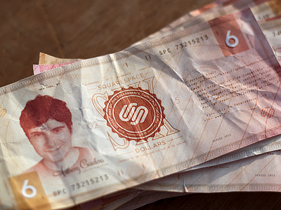
This is what I made over the weekend. I've always wanted to design a bank note, so that's what I did. I thought of simply remaking the US dollar and slapping the Squarespace logo on it but that felt too easy, so I tried to design a more unique bank note. I did some research and took inspiration from various different existing notes and then just improvised. Took me a long time to get all the textures and stuff right! I guess money has to be quite complicated so people can't copy it easily huh? :P There are a lot of details that you guys might not notice right away but I like that about most bank notes, you take a closer look and you find new things.
It's 6 dollars because I assume they're still in their 6th version of Squarespace (maybe I'm wrong, but I liked their last playoff, and since it's not real I didn't want to do 1, 5 or 10 etc).
Be sure to check the attachments, and I've attached the digital one too (in case any of you wanted to print some yourself haha). This is the first time I've done anything like this and I'm quite proud of myself C:
(The guy on the left is their CEO, I hope it's okay that I used his face :3).


