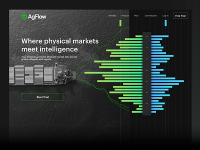
AgFlow marketing website – home page graphic
I created this graphic as part of the redesign project of the AgFlow marketing website. The idea behind was to create a visual connection between the analytics / data nature of the product and the physicality of the market it represents. In contrast to financial markets for example, the agricultural market is a tangible industry that exists in the real world and acts under its constraints and rules. Through the branding and marketing design, we wanted to represent both, this physical aspect of the market and the immediacy of the availability of the data in the platform. Here in this graphic, the vessel movement creates ripples in the water that generate data charts that are immediately delivered to the users to make better trading decisions. AgFlow is, above all, a close pulse of the market.
**Click through the carousel to see the other sections of the page.
The main objective of the new site was to move away from generic communication and, instead, craft targeted messages for the various customer segments AgFlow wanted to reach. I worked in collaboration with the sales and marketing teams to create a site architecture, content strategy and branding that could speak to the unique needs of each audience and, thus, collect leads with a higher chance to convert in the next step of the sales funnel: a personalized sales call.


