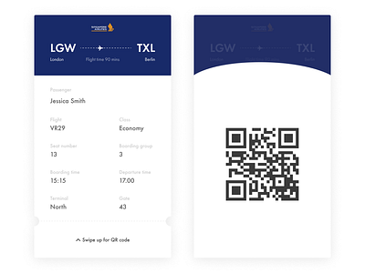
Daily UI #24 | Boarding Pass | Singapore Airlines
A boarding pass concept as part of the Daily UI Challenge, with Singapore Airlines brand colours. I wanted to have some colour restrictions for this task and make it more realistic.
A simple concept showing the most important information, with swipe-up functionality revealing the QR code for security scans. I felt like due to its occasional use it would be best not to detract from the text on the rest of the screen. Have you noticed that when you get a boarding pass, they always circle the same 2/3 things? Why not make them more prominent?!?!
Press "L" if you like the simplicity and thanks for your support as I go through the challenge!
More by Dan Andrews View profile
Like
