Introducing Haze
I'm thrilled to finally be able to share our latest app with you guys.
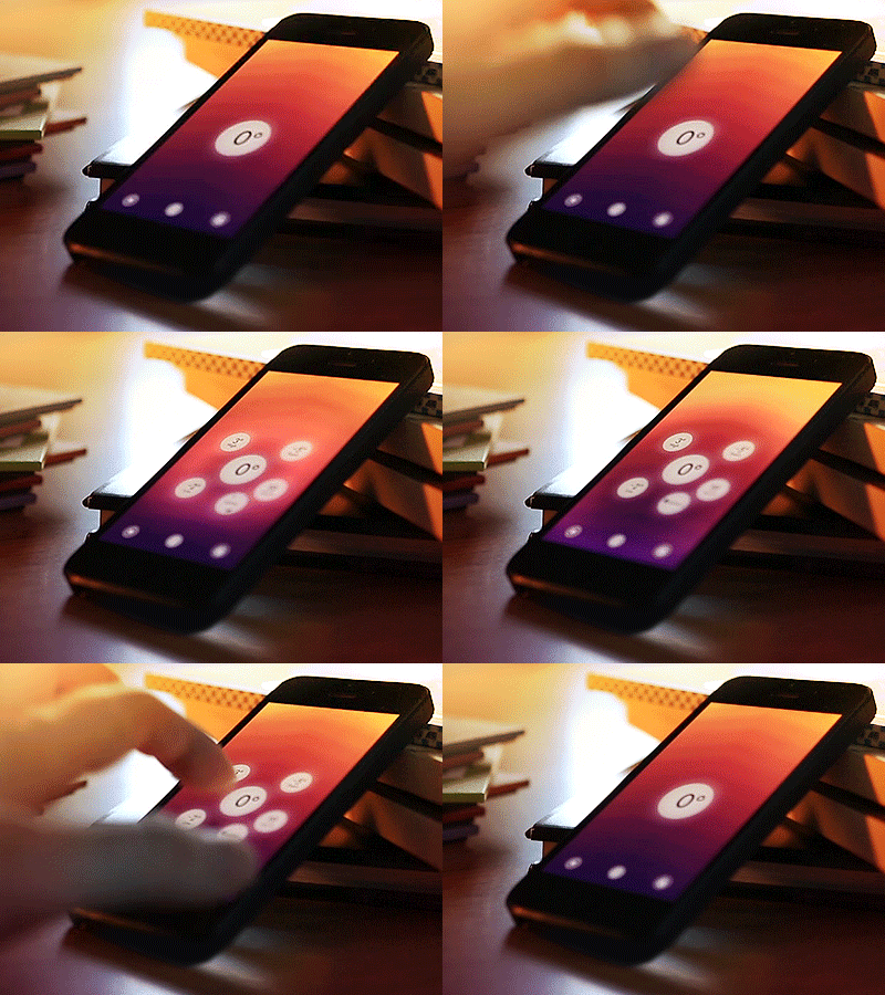
Franz Bruckhoff approached Robocat 8 months ago with a rough prototype of a new weather app he had been working on. We've spend ever since iterating and polishing on the concept, working from the simple phrase 'weather at a glance' as a guiding principle. This has gradually turned into a really interesting experiment in spatial, color coded and animated information presentation. The product is Haze an amazing weather app with fluid animations and an audiovisual interface that is both beautifully simple, yet powerfully addictive.
Compared to some of our previous projects, this was a completely different challenge and as the creative lead i got to involve myself with the more intricate parts of the interaction. Working with this type of interface was really fun and i still think i managed to imbue it with my love for color.
★ Be sure to check out the video i made on gethaze.com.
☛ Direct iTunes link
Static screenshots doesn't really do the app justice, so i attempted to show some of the interactions with gif. Excited to hear what you guys think.
___
Get My Industry Standard Design Resources
at 📐👉 applypixels.com
Premium Evolving Icon & UI templates (& a bunch of freebies)


