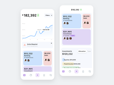
Banking Dashboard
I am trying light colors for the new version of Wealthica Dashboard. I am not quite sure about a few details yet though. Opinions and criticism are appreciated. Maybe too stacked?
Food for thoughts! :D
More by Henrik Abonyi 🧔 View profile
Like
