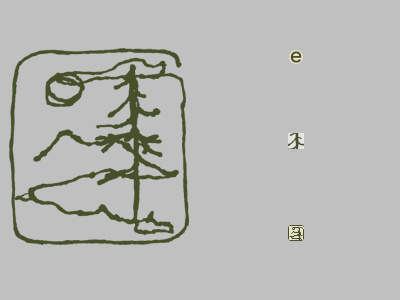
Favicons, 2nd Attempt
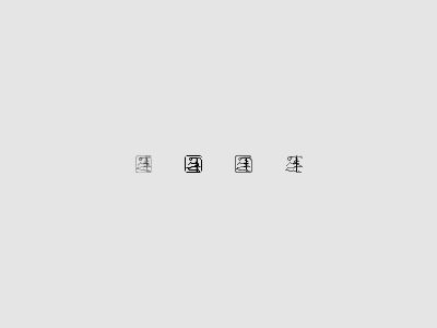
I got some pushback on my last set of favicons, so here's my second go. From left:
• Original logo, merely shrunk down to 15×16.
• 1st attempt at hinting the logo, basically by tracing on top of the previous shrunken version.
• 2nd attempt, this time isolating the border, sky, tree, and mountains, hinting each element on its own, then layering them together and making adjustments from there.
• Same process, but I removed the border, which gave a little bit more room for the main shapes to expand (which actually made hinting a lot harder).
I think I like the 3rd one the best.