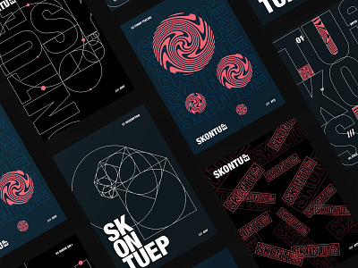
Ayit Skontu EP posters
Ayit - Skontu EP 🍥
Back in September I started a big project with my friend Ayit DJ He was about to release his first EP ever and I was willing to help him out by making his release truly stand out. "Skontu" is a Slovenian word for "figured it out". Ayit went through many ups and downs while creating this EP and my mission was to capture and illustrate the sound and feelings of the tracks. I created the entire graphical system that consists of geometry elements, bold typography and pink swirls. Bold typography communicates the night club setting. A space where people are experiencing many different emotions. Not only euphoria and happiness but also fear, anger or emptiness. This variety of emotions is illustrated with the pink swirl element. Geometry sequence, simmilar to golden ratio resembles growth; how something small can become something big. At the same time it connects all the elements together and makes the graphical composition even more raw and brutal. Along the album cover, posters, video animations, social posts and stickers, we also created a physical copy of the EP about which will soon be ready. Let me know what you think. Did you give this release a listen? Don't forget to check out https://www.instagram.com/ayitdj/. If you haven't already, check out the animations on YouTube that I created for each track.
https://www.youtube.com/playlist?list=PLI9mhW34GrbbWdyI6-4cxUpKJwCkbherW
