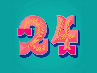
Frieda Ruh Lettering Number Numeral Christmas
Last year, I was asked to design an illustration for a Christmas card. It was one of my first commissions for a lettering-focused job and really fun to work on.
The brief for this project only had a few restrictions. I was asked to illustrate a Christmas-y greeting card without following festive clichés. My client also wanted its colours to pop.
Out of three sketches, the one that made the final cut was that of the number 24. My objectives for the numeral were to make it as bold, bright and radiant as possible and for me that meant to exaggerate the forms of the numbers and to add a glitzy 3D-diamond effect as well. To then evoke a festive feel I added a bit of fir-like foliage. I really love the softness that the foliage adds to the overall edginess of the piece without overshadowing the forms of the numerals.
