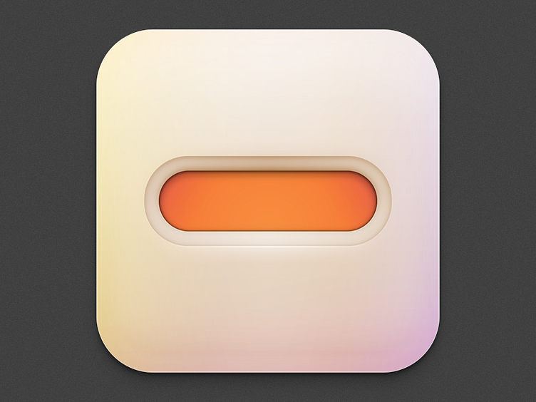
Minus
An iOS icon I made for the guys at minus (minus.com) for a new app. I kept the lid on this one for a while but just found out yesterday that they suddenly shifted the app direction, so this icon went unused. Still, the gradient came out nice, and I'm pretty happy with the results. I must've made 20 variations of this simple concept, too. Aimed for a soft, "touchable" icon look.
More by Ryan Ford View profile
Like
