Bauhaus Poster
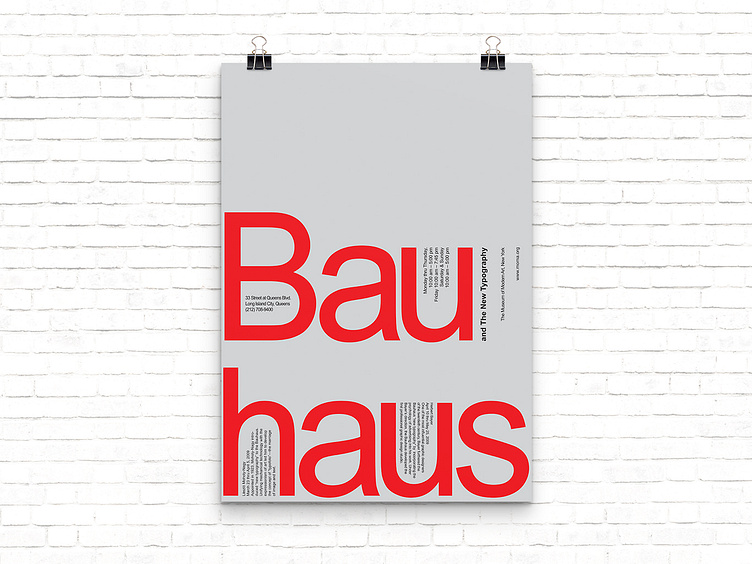
Simple poster design for an exhibition called: Bauhaus and the New Typography.
This was a challenge to play with type (no images) by using size, scale, weight, placement, direction and axis. I later added the colours - which align with Bauhaus design principles.
The type layout meets the goal of creating hierarchy and emphasis but without being overly complicated.
More by Silja Rós Wang View profile
Like
