Daily UI #019 | Leaderboard
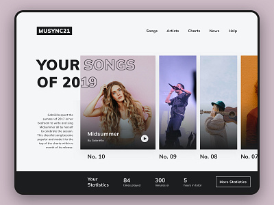
Charts are often visualised as lists—which could make the data look boring depending on the context of the displayed data. For today’s case, I made an interface for a chart that displays one’s most listened songs.
For the context of today’s data, a list wouldn’t be sufficient. The chart displays the songs that the user most frequently listened to in the year 2019. I wanted to make the users experience the data rather than just read it from a list. So, the chart can be interacted with in various ways.
First of all, the data is read like a book. From left to right. And scrolling or clicking helps to progress through the data. On top of that, the artist photos give more liveliness to the statistics itself. Secondly, the interface allows the user to immediately listen to the selected song with just one click. And thirdly, additional information about the song is displayed. The additional information about the song is shown to tell the user the song’s story. And additional statistics are shown to tell the user their personal story in relation to the song.