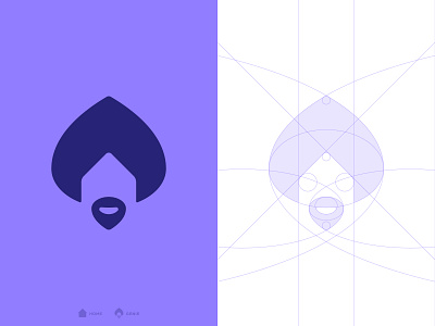
Crib Genie - Logo Grid
Cody Casserly is such an amazing client. Let me tell you why.
When we had one of our first calls after starting the project, we where talking about the moodboard i developed and how i somehow wanted to mix the concept of a genie with a house. Maybe a genie coming out of a house shaped lamp. He told me how that sounded too extravagant - he just wanted a minimal and elegant genie for the logo, nothing too fancy. He even mentioned how he loved the simplicity of the twitter logo.
Around a week later i got back to him with the idea of including the house on the negative space of the genie. I knew he didn't want it at first, but the fact that it was so subtle convinced him and he loved it!
Later he suggested a genie that was not so serious and that had a smile instead - to make it more approachable to new clients. And here is the result, the smiling genie 🧞
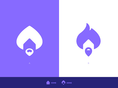
If you want to compare it to the previous version, swipe left - which one do you prefer?


