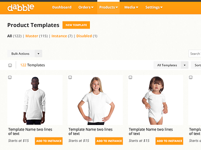
Dabble Admin Dashboard
First off - thanks to http://dribbble.com/vox for the invitation. Really appreciate it.
Working on a facelift for a web application that manages a store owners orders, templates, predesigned products, media, and more. All templates are customized with the applications product customization tool, to create on demand products inside the users store. The owner carries no inventory as everything is virtually managed within this web app. You can see our current version (attached) which is in dire need of an update, experience wise and visually.
Very initial visual explorations taking place right now, you can see we're using a top nav now instead of the side nav, which was taking up a lot of real estate that could better be used for admin related activities. Still tinkering with how that navigation system will display. Pretty sure the current state won't be final. Also implementing a notification system which should be very helpful for admins.
Contemplating the usage of orange which is the brands primary color. We don't want it to overwhelm the page, which is where the usage of grey like buttons come into play. Still working on the exact positioning of those elements as we're not completely sold on the white bar, but really depends on how much more data and options we plan to have.
One item not yet addressed in the comp is how admins will switch between shops and their instances. In most cases, there are hundreds of shops, but just a few instances nested within a shop. Current build has a drop menu which has proven to be very...painful.
The grid will have both thumbnail and list view...list is a normal table. Arrangement of details for each template will probably change...open to any thoughts.


