Tweaking the mobile view of my blog
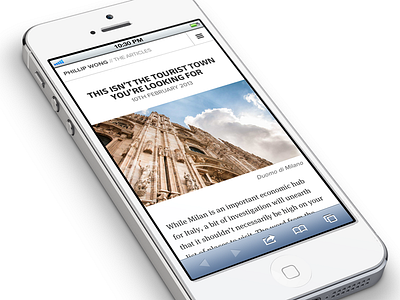
My blog is based on my photography and writing of places / things that I find interesting. The design aims to be as minimalist as possible with just enough feel being added by typography.
The heading is in FacitWeb which I like very much in uppercase but not so much in lowercase. Body text is in trusty FF Meta Serif. A little Proxima Nova is used for labels and captions.
Many thanks to Mikael Eidenberg for the great iPhone template.
More by Phillip Wong View profile
Like
