Manage Flight
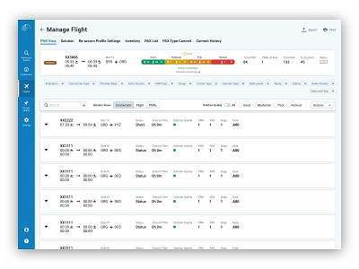
This screen from my vault of concepts is an updated version of a screen I desinged for an enterprise app I worked on in the past.
The main goal of this screen was to help orient the user to where they are in their work flow, hence the arrow beside the main title. It was also important to show the different views of information that might be relevant to their task as well as intuitive controls for some complex actions such as filter pills and global list actions.
More by Mike Small View profile
Like
