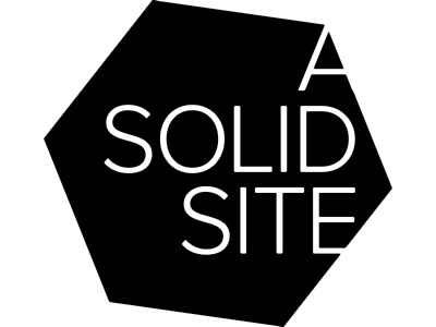
Logo for A Solid Site
Okay... I'd love any constructive criticism from the brilliant designers on Dribbble as I am brand new to logo design. I was playing with the idea of a cube shape - a "solid". I've tried making the "solid" a thicker font - but it looked too gimmicky. I've also tried filling in the "o" and the "d" and it looked unbalanced. When I get it right in BW I'm going to use a dark, luminous, cool blue in lieu of the black.
Scary - first shot!
More by Heath Waller View profile
Like
