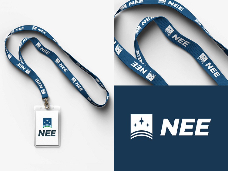
Concept logo | Round 3 | Lanyard
Here's the third concept that went through the wringer. My previous post included the second iteration of the design.
Essentially, the logo is for a gov program focused on upgrading legacy systems through digital transformation. Simplicity is expressed in this logo variant. The mark stands next to the logotype as a shield. The layers of the shield represent land, air, sea and space. The clean presentation relates to the outstanding and professional work that the customer stands for.
More by Robert Mathews View profile
Like

