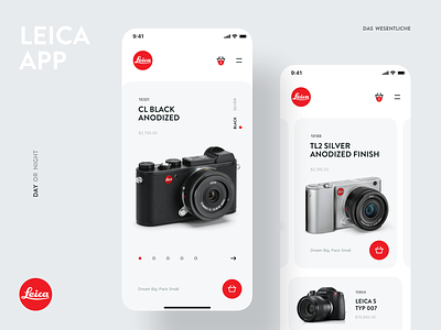
New Store for the Leica Application | Dark and White Themes
Have you ever wondered how the Leica dark store app could look if a professional designer would take hands on it?
So here you have it! Introducing you the dark/white theme for Leice photocamera store!
We made a new concept for the famous Leica photo camera store!
What so special in Leica? Many photographers swear by the Leica lens, claiming that its superior build and the incredible quality of its glass makes it the best in the industry.
Our design matches the style of the product itself. A simple and unobtrusive color combination. Nothing extra.
What do you think? Is this design acceptable enough to become an official one?
Share your opinion in the comments!
And don’t forget to leave i “L” here! ;)
More by Anatoly View profile
Like

