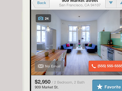
Listing Detail
One of the most important screens for the Lovely iPhone App where users get to see listings in detail, flick through images, favorite, email, call, go next, previous, get directions, read through amenities, etc. I know feature explosion in one screen, but when you think about it you need all these things when you're searching for an apartment. So what we did was to give it structure and hierarchy. Do I think we did a good job? I think for a first release this screen has a good structure, but it definitely has room for improvement (which is in the works). Needless to say, feedback we get from users is key. Keep in mind, grandma compatibility mode was turned on while designing this screen :)
So if you've used this app, I would love to hear what you think about this screen. Is it serving the purpose for you? Are you finding things weird, or difficult to achieve?
If you haven't used the app and interested, you can download the app and play with it, if you're in the apartment hunt in a bigger city, you won't regret using this app.
And definitely go check out the other shots in the LiveLovely Project.
Thanks.

