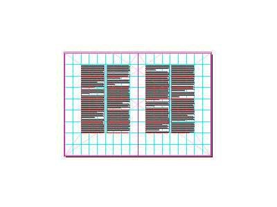
The grid for a forthcoming new publication
I've been delving into old-school grid theory to tighten up my print design work, primarily for this: a new publication from Viewport Industries coming out this summer. The magenta diagonal lines show the Van de Graaf Canon to dictate the ideal placement of text blocks on the page; which also corresponds to Rosarivo's Gutenberg Canon, indicated by the cyan horizontal and vertical lines, which splits the page into ninths. I love this stuff!
More by Elliot Jay Stocks View profile
Like
