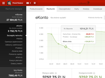
Bank's client area
So the bank I use is now working on their new client area dashboard design. They recently showed some screenshots of what's coming up. And in my opinion it sucks so much, I can't stand it. So I decided I will try to design my own version.
This took around 5 to 6 hours, including mobile version. No mockups, no sketches. Just pure photoshop work.
You can see both desktop and mobile design on Behance.
Oh, and yes, I know I should use bars for this chart, not line. Sorry for that.
More by Pawel Kadysz View profile
Like


