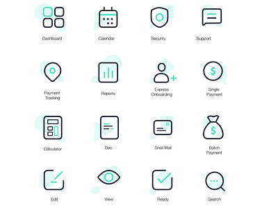
Brand Icons
In building your brand oftentimes your icons are overlooked. Continuity in your brand is extremely important. So every little part that a customer interacts with has to be intricate and purposeful. We wanted to make sure our icons screamed Gig Wage. We took the time to pick the correct line weights along with adding a little flair of our primary color to give it some life. Gig Wage is a sleek payments company and we wanted that to show in our icon design.
More by Jarrod Ausborne View profile
Like
