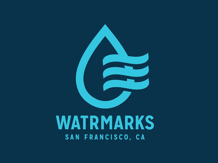
Watrmarks Logo WIP
One of the most exciting projects I've been working on in a very long time and I don't like to be all secretive and whatnot, but I'm not gonna say too much about this just yet, except that Watrmarks is a company based in San Francisco (Condolences for the Superbowl, btw. So close!) and it involves water and snail-mail.
We've been working on a handful of concepts. This one came out on top and we're very happy it. Might need a bit of tampering still, but it's close. Me and Simon laid down the finishing touches today.
Want to give credit and thanks to Riley Cran from Lost Type and James T. Edmondsson for handing us their soon-to-be-released typeface Mission Gothic that James designed.
Mission Gothic was born out of the inspiration from the Lost Type Field Trip to Mission, San Francisco last spring, so the story behind it felt like a perfect match for Watrmarks and it's just a stunning typeface.
