FiveSix: Color Study
Brand Exploration 3/4:
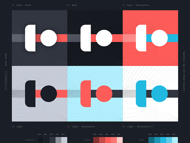
Initially, I created the logos and app icons for FiveSix with a small palette that composed of different shades of graphite and a singular coral. While this sufficed for initial design direction in the application itself, I felt that there needed to be an expansion of the color palette to eventually support lighter theming, as well as variety in marketing collateral.
To complement and contrast the coral, I defined a suite of aqua colors to add to the palette. With the varying shades, I've defined a set of "themes" that can be utilized across any composition: dark, dark-shell, dark-alternative, light, light-alternative, and light-alternative2. These are demonstrated by the variations of app icons displayed here.
More by Jon Bongato View profile
Like
