Logo (ver 3)
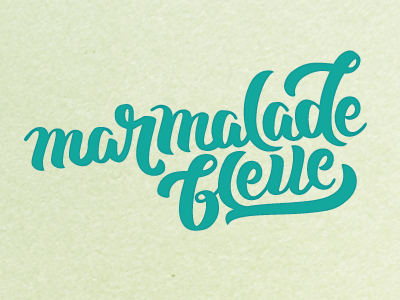
This is the third iteration, now with all the words. I adjusted the contrast on the a's, the tops of the l's, and became a little less concerned with keeping consistent, which feels more interesting. Thanks @Joseph Alessio
for your thoughts, btw!
I'm not sold on the b and the top L still feels a little funny. This is closer to the final color (I think). Still open to suggestions, if you have them!