Cafe menu app screen design - accessibility
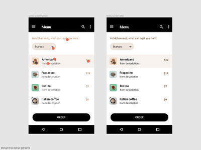
Small color adjustments can make your design accessible for more people. On the left screen, red circles show areas that failed higher accessibility test. On the right is the same app screen but it's accessible for more people, only because of these little color adjustments.
Shot from a user experience design project that I worked on recently.
Lesson learned is that you can push your design further by taking care of these small tweaks which will make your design accessible for more people