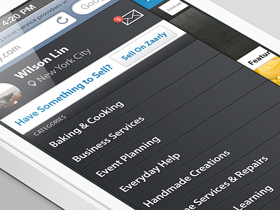
Zaarly redesign flyout menu
This was designed for the KPCB design fellows application. I saw that Zaarly didn't have a responsive site so I gave it a shot. Here's a look at the flyout menu, of course better @2x. Let me know what you guys think!
More by Wilson Lin View profile
Like
