Continuum Projects brand exploration


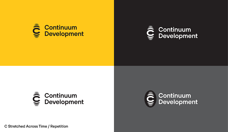

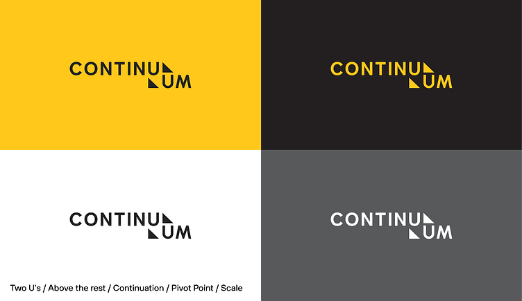
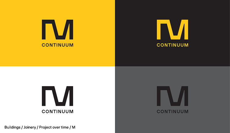
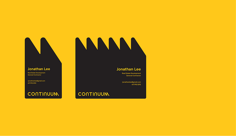
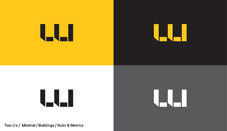


More explorations from a recent project for continuum development company. Tried for some finishing nails hidden in the negative space of the last option. For some reason the U's and M's in continuum make for a much more compelling mark than a C ever could.
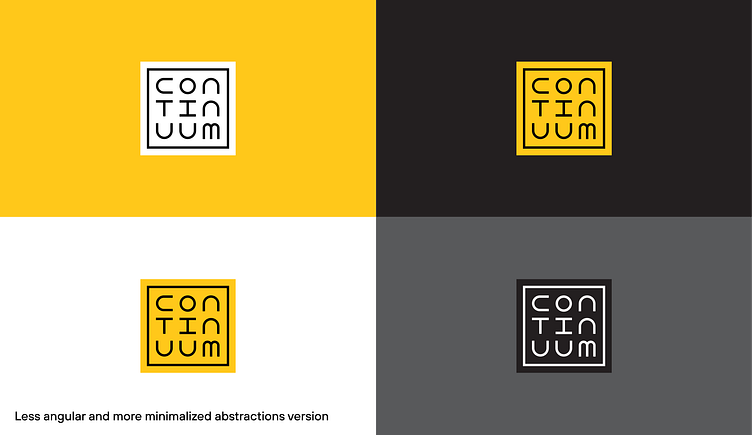
More explorations from a recent project for continuum development company. Tried for some finishing nails hidden in the negative space of the last option. For some reason the U's and M's in continuum make for a much more compelling mark than a C ever could.
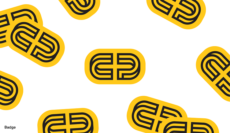
More explorations from a recent project for continuum development company. Tried for some finishing nails hidden in the negative space of the last option. For some reason the U's and M's in continuum make for a much more compelling mark than a C ever could.