Built Robotics Logo

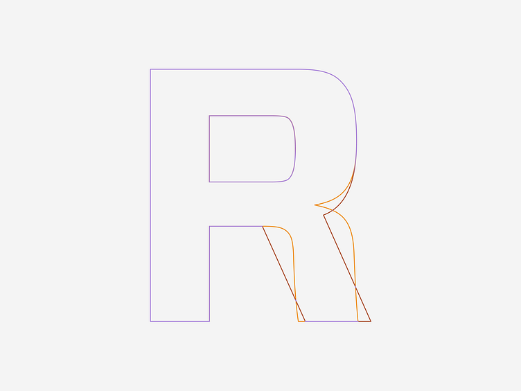


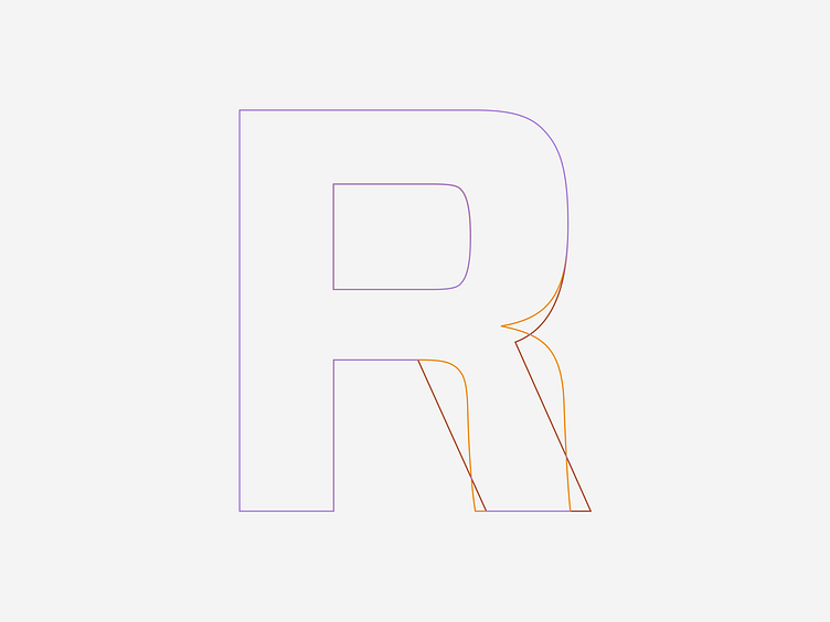


For Built Robotics, I redesigned and revised the older logo I created for them. This time, I paid closer attention to creating a proper sense of balance and sturdiness which the older logo lacked. More unique type treatments like the wingtips were added for ownership of the type, as well as a redrawn R. The existing R of the Forza font by @hoeflerco had softer curves, but I straightened out the tail of the R to have better structure for this logo.
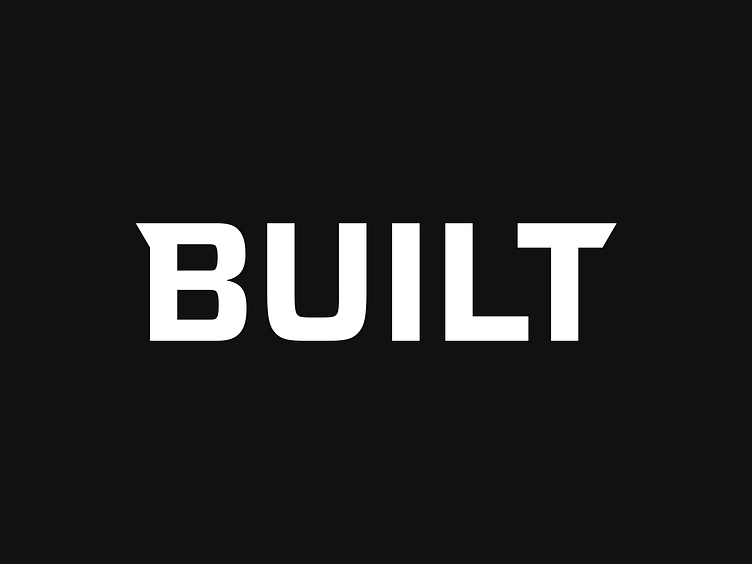
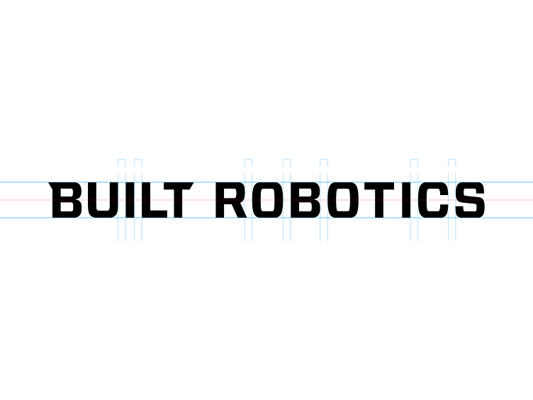
For Built Robotics, I redesigned and revised the older logo I created for them. This time, I paid closer attention to creating a proper sense of balance and sturdiness which the older logo lacked. More unique type treatments like the wingtips were added for ownership of the type, as well as a redrawn R. The existing R of the Forza font by @hoeflerco had softer curves, but I straightened out the tail of the R to have better structure for this logo.
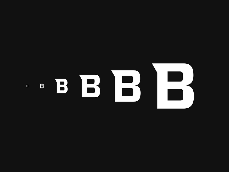
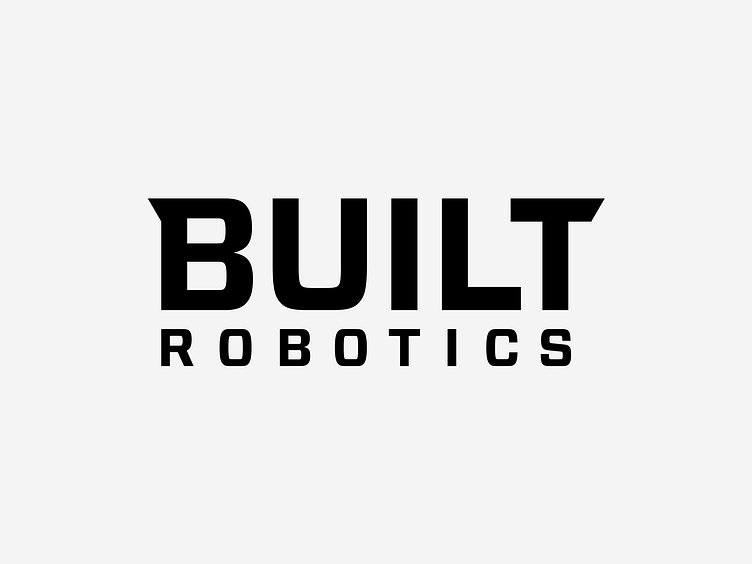
For Built Robotics, I redesigned and revised the older logo I created for them. This time, I paid closer attention to creating a proper sense of balance and sturdiness which the older logo lacked. More unique type treatments like the wingtips were added for ownership of the type, as well as a redrawn R. The existing R of the Forza font by @hoeflerco had softer curves, but I straightened out the tail of the R to have better structure for this logo.
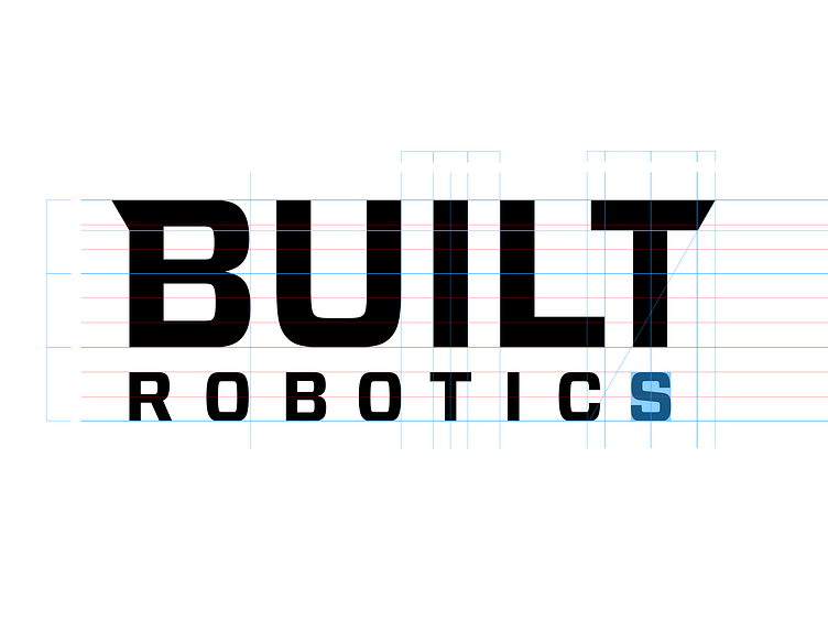
For Built Robotics, I redesigned and revised the older logo I created for them. This time, I paid closer attention to creating a proper sense of balance and sturdiness which the older logo lacked. More unique type treatments like the wingtips were added for ownership of the type, as well as a redrawn R. The existing R of the Forza font by @hoeflerco had softer curves, but I straightened out the tail of the R to have better structure for this logo.
For Built Robotics, I redesigned and revised the older logo I created for them. This time, I paid closer attention to creating a proper sense of balance and sturdiness which the older logo lacked. More unique type treatments like the wingtips were added for ownership of the type, as well as a redrawn R. The existing R of the Forza font by @hoeflerco had softer curves, but I straightened out the tail of the R to have better structure for this logo.
For Built Robotics, I redesigned and revised the older logo I created for them. This time, I paid closer attention to creating a proper sense of balance and sturdiness which the older logo lacked. More unique type treatments like the wingtips were added for ownership of the type, as well as a redrawn R. The existing R of the Forza font by @hoeflerco had softer curves, but I straightened out the tail of the R to have better structure for this logo.
For Built Robotics, I redesigned and revised the older logo I created for them. This time, I paid closer attention to creating a proper sense of balance and sturdiness which the older logo lacked. More unique type treatments like the wingtips were added for ownership of the type, as well as a redrawn R. The existing R of the Forza font by @hoeflerco had softer curves, but I straightened out the tail of the R to have better structure for this logo.