Itinerary Details
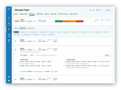
Here’s another screen from my concept vault where I was trying to depict what the user would see when expanding the flight grouping.
This screen also shows an example of how filters work indicated by the blue ‘Good’ pill. Initially selecting it would have brought up a popover with related selections.
More by Mike Small View profile
Like
