five°lab
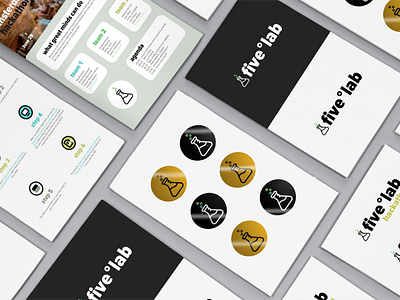
fiveºdegrees developed an innovation lab where its employees are encouraged to contribute their ideas and challenge themselves. They were looking for a sub-brand identity that matched the experimental and creative nature of an innovation initiative, yet in line with the brand identity. The company's brand identity is simple, clear, and minimal - effective and straightforward. For the main logo, we decided on a chemistry beaker to represent the experimental nature of the innovation lab. The icon depicts 3 colored degree signs for the beaker bubbles, as fiveºdegrees often uses degree signs in their visual branding. Within the fiveºlab, there are three sections: the hackathon, the wall, and Github. The colored degree signs are representative of each of these sections, adopting the brand's secondary color palette. The fiveºlab wall is an open space where employees can write, draw, or explain their ideas, which may be selected by the company for further development. The fiveºlab hackathon branding was used for digital assets, printable materials on the days of each hackathon, and promotional stickers. The gold stickers are reserved for employees whose ideas written on the fiveºlab wall were selected for implementation.
