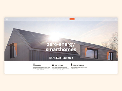
Acre Designs Website
The thing about a really high value product versus a free for consumer SAAS offering is that quality of sales leads and lifetime customer relationships actually matters significantly more than quantity. There's a smaller sample size and a much more complex interaction. This website concept focuses on culture fit and early vetting for the kind of customer research had zeroed in on, featuring a scroll-stop landing page with each screen devoted to a bold high level concept. From there, an interactive information hierarchy goes a few levels deeper to answer frequently asked questions. The mockups here show a wide desktop screen. The layout is actually on a simple 12 column responsive grid, centered on the page with wide margins that cover shots scale to fill. The spreadsheet shows how I thought about the content strategy - mapping aspects of the product value proposition to more emotionally-driven concepts and descriptive copy.


