Ibúgbé
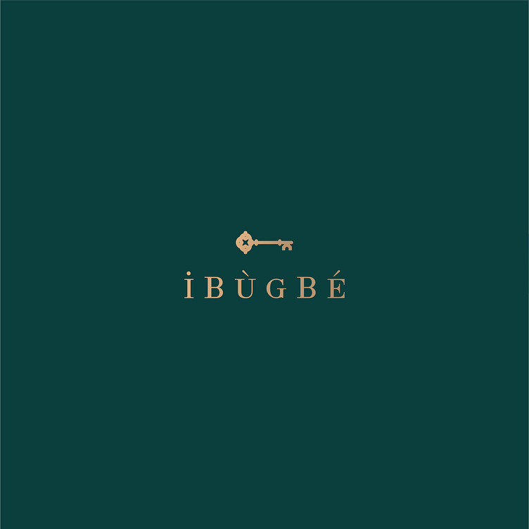

Ibúgbé is a yoruba word, which when translated to english means ‘abode’. This is fitting as Ibugbe is poised as a real estate brand aiming to provide the best quality in design, construction and experience of residences across the nation.
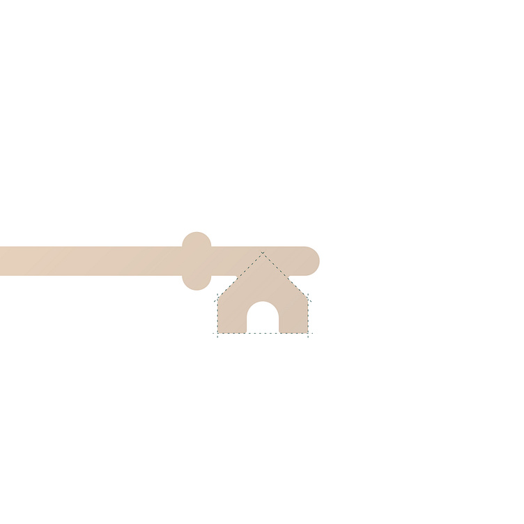
The logo for Ibúgbé is a logomark which features a key. This is symbolic as prospective clients buy into the vision of owning the keys to their homes. A subtle feature of the logomark is the key’s cut which has been designed to look like a house - You can interprete it as an African house with it’s circular entrance.
The logotype is equally unique in it’s design. It has been stylised to look African with it’s accents positioned atop their respective vowels. The font size has been varied to mirror the word ibúgbé in lowercase..
We'd love to work on new and exciting projects. Kindly get in touch here - hello@dzisan.com
