Evolution of the NoiseES Icon
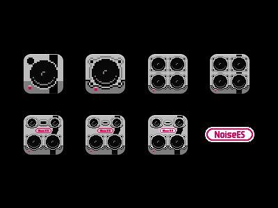
From single grilled speaker to a stack of woofers to the diversified arrangement in the final icon.
I was trying to keep the icon to 4 colors but it ended up looking really washed out on the homescreen. The white added the necessary depth to make it feel a little bit more at home on an iOS device while maintaining its distinct aesthetic.
In this case the egg came before the chicken with the icon inspiring the larger illustration (which required the larger, readable logo type) that serves as the background when playing a song.